Monday 27 March 2017

Inter textual refernces

Many other media texts influenced my work for different reasons. The use of a mask was taken from texts such as The Purge or the band Bats For Lashes who use masks in different ways but both use them very effectively. The mask was used as a way to show how people can change when a break up happens and how you can no longer recognise them. I also wanted to include an aspect of the psychedelic genre in my music video and this can be a reference to the film Enter The Void or Asap Rock's song LSD where his video is a direct reference to the film Enter The Void.

The Purge
The Purge is a film made in 2013 in America and the plot is about legalising crime for a day. This is a horror film and that was not the element that i wanted to take into my music video but the aspect of characters wearing masks was. The use of the mask in this film is a negative and scary object that allows the imagination to run wild because you do not know who is behind the mask. This element of mystery and creating an enigma was what i wanted to include in my music video. The song 'What's a girl to do' by Bats For Lashes uses characters riding on a bike wearing masks while the artist sings. This creates a mystery and in their video it is
Bats For Lashes
the men who are wearing the masks and the woman who is not so we decided to turn that around and make the girl be chased still but she is the one wearing the mask. This then helped us create the element of love being something that can change us forever. However in both of these texts the mask creates a dangerous and scary aspect which i did not want to take into my music video so to combat this i the locations show what kind of story this was and the use of the dark and gritty locations in the film and music video crate the sinister view of the mask so a more colourful location would make that representation no longer apply.

Enter the Void
For the psychedelic element i took inspiration from the film Enter the Void which is a 2009 film where the plot is about life and death but through the eyes of someone who is on psychedelic drugs. The film uses a lot of editing that makes the audience feel they are seeing a dream like state and on a trip with the character who has taken the drugs. The use of this was something that i wanted to take into my video as the song has a part of it that links with the psychedelic genre which means i wanted to put in the effects which are generic conventions of music videos for the psychedelic genre. I wanted to introduce a dream state into my music video and i
Asap Rocky's song 'LSD'
wasn't sure how to incorporate it in. I had seen it be done in the film and didn't know if it would work for a music video. I found Asap Rocky's song 'LSD' where his video is based on the film Enter the Void. I took elements from this where i used effects and bright colours to look like the person is in a dream and this is a generic convention of the psychedelic genre so i feel that i could take that reference from the film and music video and make it into my own. The dream state would be where the male character had been given the drug of love my the female character and is in a dream state that revolves around her.    


Sunday 26 March 2017

Question 3 - What have you learned from your audience feedback?

 When collecting audience feedback i decided to use a questionnaire. A questionnaire allowed me to get quantitative data that i could then easily put into graphs and tables. I could then analyse the data easier because if i had qualitative data then i could not have analysed it in a data format thus making the audience feedback not useful.I aimed to ask 15 people and this was to try and get more reliable research. 

I chose questions such as favourite genre of music and this was to see if there was a connection between people liking my music video and print production and them also liking the same genre of music as my product. I also asked questions on how old people are and their gender. This was to allow me to see any correlation between if a particular age liked my product more or if a certain gender did as well. Problems that i faced in the research was that asking friends and family about your product may give misleading information as they will put down what they think you want however this doesn't give valid information but i feel this was not an issue in the end as my information was well rounded.      


One of the first correlations in my results i saw was the link between age and the in which they rated my media product. The older the person the less they rated my music video and my print production. The people who were aged between 25-30 rated my CD cover at a 2 out of 5. I think that this is because of the age of my target audience. The genre of music i have, which is Indie-psychedelic, has a young target audience who are on average around 18/19 years old and therefore people who are not in that demographic are not going to understand the genre and therefore feel like the product is not good and looks unprofessional. I also could link this with the question for how well does the music video match its genre as the people who answered not at all were the people in the age range 25-30. From this i can understand that if the genre of the music video or the CD cover is not obvious then the whole production and overall aesthetic of the production can look unprofessional. I would combat this by making the genre more clear throughout my production to allow people who do not know the genre particularly well still be able to recognise what genre my product is. 
I also saw a correlation between people liking my product and understanding it and what their favourite genre of music is. I asked people many aged between 18-25 and the favourite genre was indie and this had a straight link to how they rated my whole production. When asked how do you rate the music video out of 5 the people who answered 4 out of 5 were prominently in the age group 18-25 and this shows how if you are a fan of the indie genre then my product is more appalling to you. This links to my point before of how i could improve my product, i feel that i tried to challenge too many conventions of the indie genre and therefore without knowledge of the genre the production seems to not fit a genre therefore making the whole productions quality go down. If i was to do the whole thing again i would stick to conventions a lot more and not just make a video and CD cover that i want but one that would appeal to many audiences. However people who do know the genre felt like my production was a strong and professional production so a strength that i found from my questionnaire was that my product did appeal to people who were a fan of the genre.  
I found that one third of people who saw my music video did not understand the narrative of the music video. This was something that was not down to age or gender. This is something that i would improve if i was to do the whole production again as i have noticed that the narrative is hard to grasp. However this could be linked to Stuart Halls audience reception theory where audiences read a particular text according to their cultural upbringing. This shows that people may not have understood the narrative because they could not relate to it. Although i could make the narrative easier to understand i feel that the narrative and issues raised in the music video are out across in the way i intended however i could of made more hints at what i was trying to get across in the video.
Question 7 asked if people would buy my album based on the way it looks and around three quarters said they would and this is a positive for me as it shows that i created a CD cover that was stylish and professional. People said that they would buy it even if they were not a fan of the genre which shows that i have made a CD cover that can appeal to any demographic. 
Question 5 asked people if the CD cover and poster were promoting the same product and most people stated that it was. This is a positive as it shows how people thought i had a good symmetry between my poster and CD cover. 

In conclusion using a questionnaire helped me understand my audience and how i could have improved my work to allow more people to like and understand my product. I found that overall i would make the narrative of my music video easier to understand and conform to more conventions of the indie genre to them allow more people to understand my production. I feel like i reached my target audience in my questionnaire so it helped me to understand what they wanted to be improved as they were the people who i wanted to rate my product.     


Audience profile

Saturday 25 March 2017

Fonts

Choosing the right font is essential to making the CD cover, poster and the rest of the album look professional and fit the genre of the music. For my genre of Indie-psychedelic I wanted to have a font that was simple and didn't make the whole thing look out of place and unprofessional. I wanted the font to fit with the artwork I was trying to achieve which is a abstract and minimalist style of art so a thin font where the kerning is fairly big would make for a professional font for my print production.

Letter Gothic std
The first font I chose is Letter Gothic std. This font is one that was already on word for fonts. The font is a simple yet effective font that has a fairly large kerning in between the letters. This font also not very bold and that is the type of font i am looking for as i don't want the font to distract from and artwork on the print production. The font also has good typography as it looks very appealing on screen and therefore will make the whole production look professional. However this font could be seen as too childish and not fitting the indie genre. The use of the serif font for the indie genre means it could make the font stand out as being out of place and unprofessional.    

The next font i was looking at is called Neon and this font is strong as it would make for a good logo for the band. It has a distinct look with the white borders around it. The font could be used on the poster as well as the CD cover to make a recognisable logo for my band. However the font has very small kerning and this means that the letters are too close together and therefore i feel it makes the font look childish and unprofessional. The font is too bold and would distract from anything else that is on the page.
I also looked at the font Caviar Dreams and i feel like this font had the perfect typography as it can not only be a font that is used but can be turned into a logo that will create a distinct look for the band. The font is a sans serif font which then makes it look more professional as i feel that the indie-psychedelic genre would not have a font that has serifs on it because it would look childish. Also the font has a reasonable kerning to it which will fit the minimalist/abstract style of art i am wanting to achieve in my print production. However this font could be seen as unprofessional because of the letter 'e' which could be too distracting and not fit the genre.

Wednesday 22 March 2017

Evaluation of two ideas

 I chose the two ideas that i feel are the most professional and effective ones out of the four that i had to chose from. Idea 1 is taken from the ink in water pictures that i took and then developed and edited them into a full idea. Idea two is of waves crashing at a beach that didn't require many changes to make it look like a final product.
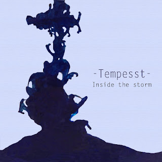
Idea 1
Pros of idea 1:
- The image relates very strongly to the theme of my music video as everything has to do with water, storms and natural disasters. The words 'Inside the storm' create a reference to the name of the band Tempesst which means a storm and therefore creates a narrative of the band taking you on a journey inside a storm with them and shows the relatability of the band.
- The artwork is subtle but also effective as it has the abstract feel to it which allows the audience to interpret it in any way they want. There is also a minimalist aspect to it and this creates an identity for the band and shows exactly what genre and what mood the band will want to create.
- The logo for Tempesst also creates a distinct name for the band and is subtle but recognisable and i feel that will expand on the idea of the band being minimalist but also professional at the same time.
- The colour pallet is blue because it links the idea of water and being in a storm. It uses two shades of blue effectively with the lighter blue complementing the artwork and allowing the audience to focus on the artwork.
- There is a strong focal point in the cover as the artwork is on the rule of thirds and has a very good composition to it and with the text also being on the rule of thirds it makes the negative space more effective as you are automatically drawn to the art and the text making the whole cover very effective.

Cons of idea 1:
- Artwork could be misinterpreted and the audience could not get any messages from it and then the cover doesn't work as a whole.
- The image could be too minimalist and the whole thing may look unprofessional because of the negative space taking over the whole cover. This could lead to the whole cover not being very eye catching and then it could all seem a bit boring.
- The artwork in places is not edited very well and the flowing water is spiky in certain places where the Photoshop is not done correctly and could have been changed.
- The font could have been different as it seems too thin and could lead to it not standing out and whole cover could be seen as too plain.
- The genre aspect may be off as for the indie genre i feel that it fits however it doesn't fit the psychedelic side of it. There could have been another element added to it that could for fill the psychedelic aspect of the cover as that is part of the genre for the band.
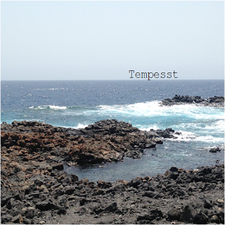
Idea 2
Pros of idea 2:
- The idea relates strongly to the whole narrative of the music video and how the song is called 'Tidal Wave' there are waves in the image. Also it has a reference to the video as in my music video i have an overlay of waves crashing when the lyrics 'tidal wave' are sung and this means this idea has a direct link to the music video and therefore shows how everything is connected and keeps the whole production fluid.
- The use of Tempesst being on in the horizon creates the narrative of a journey happening and this links to the journey that happens in my music video. It allows the audience to feel like they are connected to the band as the bliss of the beach is a paradise for most and shows the type of mood the band is wanting to set.
- This also has a minimalist aspect to it and i feel that, that can be a convention if indie covers as indie music is about self expression and abstract and minimalist artwork creates meaning and that is what the audience for my band will want. 
- The composition is good as it has the horizon directly on the rule of thirds making the bands name the first focal point when you see the cover and this means the cover is doing what it is mean to by drawing you in and selling the product as you are drawn into the horizon and the bands name straight away. 

Cons of idea 2:
- The idea is too simplistic and i feel compared to the other idea is very unprofessional as the text doesn't fit with the image and all looks out of place. 
- The rocks and the water clash too much making the idea look too basic and not have the right look that i was looking for.
- It doesn't really fit any of the genres as the calmness of it doesn't fit the indie aspect of it and there is no link at all to the psychedelic aspect of the genre for the band.
- The font doesn't fit the image at all.
- It does not have any real narrative to it unlike the other image which is 'Inside the storm' and therefore creates a disconnect with the band and the audience as it is not at all relatable and therefore makes it very unprofessional.   


Logo ideas

Pitch

My video is based on a love story. It consists of 2 characters where one is trying to chase the relationship even though it is broken. This video follows their relationship struggles as it shows the boy being blinded by love and fixated on the girl. He follows her through several city locations in an effort to find her and remove her mask.

Q4 - How did you use media technologies in the construction and research, planning and evaluation stages?

Digipack

Front Cover
Inside Panel 1
Inside Panel 2
Back of Album
Magazine Advert

Tuesday 14 March 2017

Q2 - How effective is the combination of your main product with ancillary texts?

To create a brand and an identity for my band, 'Tempesst', I had to create a symmetry in both the mad advert and the CD covers that linked to my music video that would allow the brand to be clear.

Figure 1
Visual links have been created in both my advert and CD covers as i have used the same fonts throughout to allow the brand to be created. In my cover i have written Tempesst with a visual motif either side of it to make it different from just having plain text. I have done this to create the brand and allow the band to have a recognisable logo. I have then taken this into the rest of my CD covers and advert. The use of the band name written in that style has been carried out through the print production to create the visual link. The blue on blue colour scheme has also been carried out in all aspects of the print production to create a colour scheme that is noticeable and the significance of these colours is that it links in with the theme of  'Inside the storm' which is the theme of my print production and the visual links of the blue allow the connection to be made. I have used the same font in all sides of my album covers and in my magazine advert as the font is one that is not too distracting and links well with the artwork as it has the same calm design that i have used for the artwork of my print production. I feel this font is very effective as it does not look out of place or does not draw attention away from the visual links of the ink artwork. I have used the same composition  in my CD cover and in my Magazine advert. I have placed the artwork on the rule of thirds as it shows how the album and the CD's visuals link together. It also makes the audience immediately notice the visual links that are in the CD cover and the magazine advert because their eyes are naturally drawn to it.
Figure 2


Figure 3
There is a clear thematic motif created between my music video and my print productions as i have used an overlay of waves in my music video and this links to my advert and my CD cover as they have water running through creating the theme of 'riding on a tidal wave' as the lyrics in the song say and that I have used in my CD as shown in figure 1, with the name of the album 'Inside the storm'. These links allow the theme to be created of how life is like a storm/wave and how at any moment it can come crashing down. The use of the quotes and the title of the album create the theme but also the audience can create their own theme and read it in whatever way they like as art is perspective and especially abstract art so the theme of 'Inside the storm' can be interpreted in many way by the audience. The theme could have been made more clear in my magazine advert as there is no clear thematic link between the CD and advert as it lacks quotes and the album name so the them can not be seen very well so to improve i would try and make the theme clear in the advert by putting in the album title. A way in which I would improve my work would be to create more thematic links in my advert and CD with the themes of how women have more power in love than men. That is the main theme of my music video and I would incorporate that to allow a more coherent theme to be created in the whole of the production.


Question 1 part 2

Thursday 9 March 2017

How are narrative techniques employed in U2's video Every Breaking wave

"Every Breaking Wave" is a song by Irish rock band U2. It is the second track from their thirteenth studio album, Songs of Innocence, and was released as its second single. It was produced by Danger Mouse and Ryan Tedder, with additional production from Declan Gaffney. Initially rooted in post-punk, U2's sound grew to incorporate influences from many genres of popular music, yet has maintained an anthemic sound. Their lyrics, often embellished with spiritual imagery, focus on personal themes and sociopolitical concerns. Popular for their live performances, the group has staged several ambitious and elaborate tours over their career. 

The song was in the top 30 in the US and in the charts for France. It reached number 7 in Belgium and did very well in the UK. Rolling Stone ranked "Every Breaking Wave" as the third-best song of 2014, calling it a "stark, shimmering ballad" that stands as the "emotional centre piece of Songs of Innocence".


The song's official music video is a truncated, four-and-a-half-minute version of the 13-minute short film Every Breaking Wave, which was directed by Irish director AoifeThe film dramatises the violence of The Troubles in Northern Ireland during the 1980s by depicting a teenage couple on opposing sides of the conflict. McArdle used the album and acoustic versions of "Every Breaking Wave" in the film, along with another track from Songs of Innocence, "The Troubles". The film premiered on 12 February 2015 before the music video was released on 23 February.


Figure 1
The video follows Tzvetan Todorov's theory as he states that it should have five main points. A state of equilibrium where everything appears calm and normal. Then a disruption or disequilibrium where it is a set back, then a realisation then an attempt to repair the disruption and then back to the equilibrium. The video has these elements as in the beginning there is are shots of young people partying and there is a sense of calm and normality. As you can see in figure 1 a clear sense of equilibrium is being created. This carries on to when the the protagonist, in this case the boy in figure 1 meets a girl and they are shot in very scenic places such as the country side and in a sunset thus creating the equilibrium. This soon changes as the disruption is when the protagonist sees his dad in trouble with the police and he has to try and help him with his friends. This immediately changes the video and there is a clear sense of panic from the main character. The shot in figure 2 of the boys running together  shows the panic as before that the boys had always been smiling or having fun      
Figure 2
together so having a tracking shot of them running shows how the story has had a turn for the worse and how it has effected them. There are then hand held shots of a group of people who are trying to fight off the police and get the main characters dad out of trouble. The use of shallow focus and deep focus in these unsteady shots shows the panic and allows the narrative to be told about how the situation has changed dramatically. Also after this the boy and girl character and separated and not in shots together for the first time which reinforces the disequilibrium. The narrative then has a realisation as the boy and girl are in shots together again as there has been a realisation of the disruption. The main character tries to then repair the situation by him and his friends getting guns to help out his dad with the people he got into trouble with. However the final scene of the video does not follow the theory as it end with a bomb being set off and the main character and his friends being injured in the explosion leaving the story on a open ending. Although the ending does not conform the theory the rest of the video does and follows the clear pattern of Todorov's theory. 

Another theorist is Roland Barthes who states that at the beginning there is an enigma which allows the audience to guess what happened and creates tension. This is when the main characters dad is doing a deal with people he knows and the main character knows its trouble but doesn't do anything about it. This leads to the audience trying to guess what was happening thus creating an enigma. Another narrative technique of Barthes is the hermeneutic code which is where they avoid telling the whole truth so they drop clues and create mystery and it allows them to make the narrative interesting and keep the audience guessing. This is shown when the main characters dad gets arrested as we do not know why he has been arrested for but we have to guess ourselves which allows the narrative to have the mystery and draw in the audience.        


Visual styles